
We’re just weeks away from Election Day and it can’t come soon enough, apparently, for people who are in the business of data visualization, creating spiffy interactive maps that are intended to reveal new depth in analyzing who we are politically.
We reached peak data this week when FiveThirtyEight released two maps.
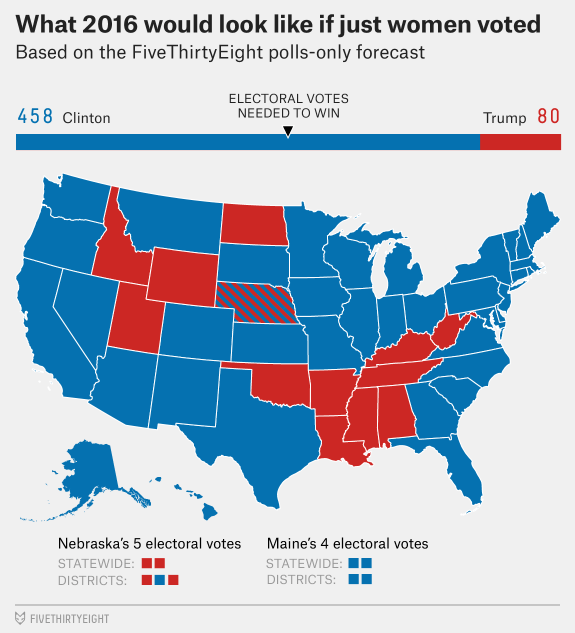
The first, in the wake of the weekend news about Donald Trump’s locker-room talk, showed us what the electoral map would look like if only women voted.
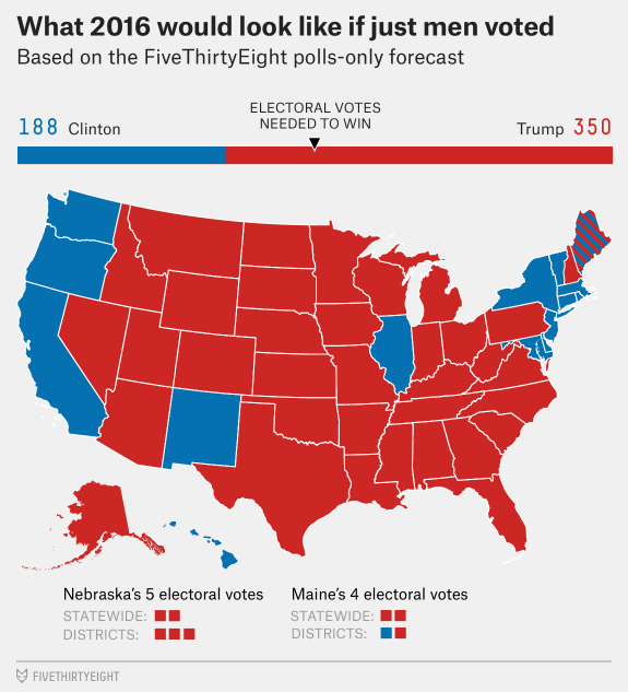
And one that showed what it would look like if only men voted.
We know, of course, that both women and men are allowed to vote so the hypothetical is only intended to show us that men and women are different politically, something that can be said with a few words but in 2016, it’s nothing if it can’t be ginned into a map of some sort.
But Twitter, bless its heart, has had about enough of this and today people expressed their exasperation in the only way they could: by Tweeting.
Here’s what the electoral map would look like if we wanted to troll Morrissey. pic.twitter.com/rkEyrnReXs
— Mike Monteiro (@monteiro) October 12, 2016
Here’s what the map would look like if only trees voted. #election2016 pic.twitter.com/Yetc7Huo7D
— Brian Gilham (@bgilham) October 12, 2016
What this election would look like if only hedgehogs were allowed to vote. pic.twitter.com/DAp6udFGdU
— PrincessPricklepants (@PPricklepants) October 12, 2016
This is what the US election would look like if only highways voted. pic.twitter.com/RmJvuXRXwB
— Matthew Bevan (@MatthewBevan) October 12, 2016
BREAKING: What the election would look like if only #sorghum voted. @FieldNotesBrand pic.twitter.com/nV3Zr4Pacu
— Ryan C. Jerz (@mrjerz) October 12, 2016
Here's what the U.S. election would look like if everything was meaningless and life is just a giant expanse of nothing. pic.twitter.com/wEQbLfvRD4
— Jack o' Joe Veyera (@JoeVeyera) October 12, 2016
(h/t: Julia Schrenkler)