
We learned something fascinating today in the Grand Forks Herald story about a new license plate for North Dakota: There is a contest for the nation’s best license plate. The state’s “new” plate apparently won the distinction a year ago.
This is the “sunrise” plate. Ain’t she a looker?
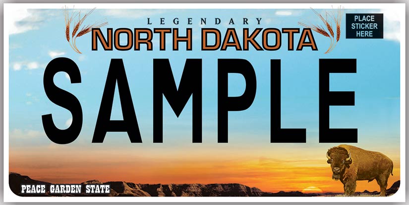
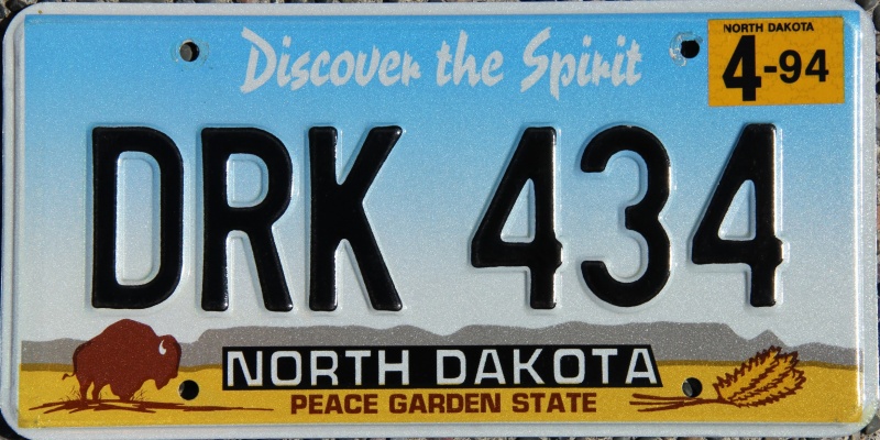
It replaced the “buffalo” plate, which had been used for so long that they were literally falling off cars and trucks.
The new plates caused a bit of a stir because the font used had some personality to it — an Old West style. Critics said it was hard to read so the font has just been changed to something more boring.
People take this license-plate stuff pretty seriously.
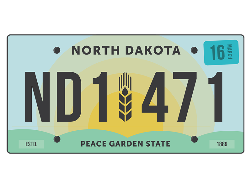
Ashton Rose, a designer, wrote that the North Dakota plates are the “black sheep” of the nation’s license plates.. It failed at every task assigned to the concept of “design.”
In conclusion, I think its very easy to say that this design has failed the test. And not in just one area, but nearly all the principles of design. The greatest tragedy of it all, is how legibility has been thrown out the window. The one core function of a license plate is to identify vehicles, but without proper legibility, what’s the point? If you can hardly read the new license plate text from a computer screen, how do you expect us to read it when we’re 10 feet behind another vehicle on the road? What’s worse yet, is the fact that legibility wasn’t even identified as the main goal of the plate to begin with. This is a classic example of ‘designers’ choosing preference over function. Design cannot and should not be about what I like but rather what works.
What works is often found to be complemented by what looks good, but they cannot be reversed. So, why does this new design upset me? Not because I don’t like the gradient of the sunset colors or the fact that I can’t stand the disastrous typeface, but rather because it doesn’t function as it should. Everything and anything about the design screams that the principles of design weren’t even considered, and for that I am appalled. I’ve been apart of pro bono design projects that were given more thought, let alone spending 6.8 million dollars!
Rose offered a suggestion.
There’s no accounting for taste, though, in North Dakota or anywhere else because the voters for the Automobile License Plate Collectors Association thought the North Dakota plate was tops.
Which brings us to the the plate which made the final cut in this year’s contest, the voting for which ended last Saturday.
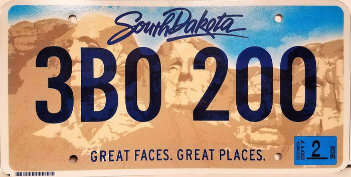
As I wrote a year ago yesterday, many residents hated the new plate because the background looked like dirt.
But South Dakota has a shot at license-plate pride in this contrast. Most of the other finalists are uglier.