
The end of the Clearview typeface on the nation’s highways has begun.
It’s the typeface used on highway signs and yesterday the 30-day waiting period for people to raise a ruckus over the Federal Highway Administration’s decision to eliminate its use expired.
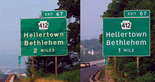
Clearview was invented by graphic designer Donald Meeker of Oregon, who figured out how to make signs more readable for older drivers — the fastest-growing demographic on the highway — without making the signs bigger, according to a profile on Quartz.
Meeker, O’Hara and Montalbano redrew the letterforms in Clearview specifically to counter bad road conditions. They eliminated “light traps” or tiny notches in joints of the letterforms and cleaned up the letters’ shapes to mitigate the halo effect at night, due to the sign’s reflective surface. They also increased the negative space in the letters “a” and “e,” which tend to close in from a distance. These small typographic refinements were posited to improve legibility of the letters without increasing font sizes.
In a statement to Quartz, Meeker expressed sadness over the decision to abandon Clearview, but says he will continue to work on improving US public signage. “This is disappointing because we are quite sure we are saving lives with longer reaction times by older and all drivers,” Meeker writes. “But it is out of our hands.”
But state agencies have to pay to use Meeker’s font. And that’s the rub. Using “Highway Gothic” is free.
Writing in the New York Times today, Henry Petroski, a professor of civil engineering, laments its return.
The difficulty that aging drivers have in reading highway signs was among the problems that the graphic designer Donald Meeker and the type designer James Montalbano had sought to alleviate with their Clearview font.
As with any problem in design, the first step toward solving it is to understand how and why existing approaches fail. In the case of a face like Highway Gothic, the close spaces between the strokes of letters like the vowels a, e and u tended to appear filled in, especially under bright lights, making them indistinguishable to the reader. Also, the lowercase letters i and l were difficult to distinguish (as they are in many an e-mail message), and these effects were heightened at night by the reflective surface of highway signs.
Few experts seem to suggest that the returning old font is better than Clearview; in fact, almost everyone seems to acknowledge that it was a step forward to make the signs more readable.
But the government never mandated its use, so states were free to stick with the less-readable font — Highway Gothic.
The decision will have no impact on Minnesota’s roads. The state doesn’t use Clearview, which is employed in North Dakota and South Dakota, and on the Madison Beltline in Wisconsin.